Less is More. Reducing Color to Improve Usability
·7 min read
The colors of a traffic light tell you what actions to take: slow down, stop, go. Color is powerful. It evokes feelings, communicates importance, and encourages action. In the Signal Sciences UI (what we call “the console”), users often log in when they need to investigate suspicious activity from hackers. These moments can be hectic because users need immediate access to information and often jump in and out of multiple security apps. Our console relies on color to support our users’ context and help them prioritize information.
Our design system had some basic color guidelines around messaging (e.g., use red for errors and green for success), but these were table stakes. We didn’t have consensus when it came to fuzzier use cases like what color to use for our range of statuses.
We left these decisions up to each individual designer, and over time inconsistencies began to grow. Color turned into a distraction instead of providing clarity. Instead of trying to fix these inconsistencies on a case-by-case basis, we started from the ground up and reevaluated how we use color across our entire design system.
Audit all the colors
We began by auditing every color in the console and logging its usage. We asked ourselves: What color patterns already exist? Where and why is color confusing and inconsistent? Where does color interfere with usability?
Our audit revealed that our UI relied on color too much:
- Blue was heavily used—from links to buttons to status labels. The amount of blue felt overwhelming.
- Green was used for many different use cases, which watered down the color’s significance. We used green for: success, new, open, active, enabled, and blocking mode.
We also found that color was confusing whenever we associated “good” with green and “bad” with red. This association came from the green=success and red=error connotation but it didn’t translate well in other contexts. Here’s an example of where these colors felt off:
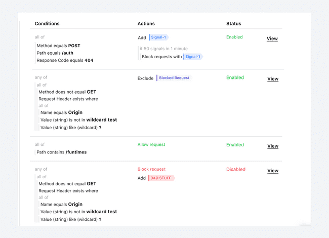
- “Enabled” is green, but enabling a rule is neither a good nor bad thing.
- “Disabled” is red, but it doesn’t mean that something bad happened. Our users intentionally disable rules because they set them to expire.
- “Allow request” and “Block request” are also neither good nor bad things. They are neutral actions that users intentionally configure.
We wanted to reserve red for truly bad things, like an error or an attack signal (which indicates malicious behavior to our users). We also wanted to tone down the usage of green with a neutral color since we already used green to represent success messages. Our solution was to remove all color from text strings and add a subtle dot indicator for statuses.
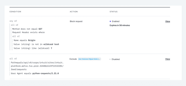
We changed “enabled” statuses to our brand purple, and “disabled” statuses to grey. This now feels much cleaner and has a neutral tone, rather than a heavy-handed emphasis on good or bad.
Another example of color confusion was on our trend indicators. Here, green (good) was always paired with an upward arrow and red (bad) was always paired with a downward arrow. This can be confusing because sometimes a downward arrow can indicate a positive trend (think a decrease in attack requests) but the arrow still displayed as red.
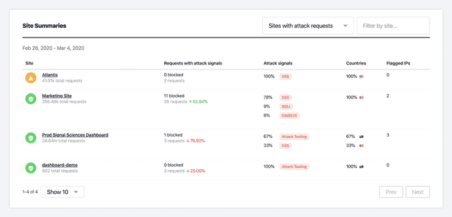
First, we tried removing color entirely from the trend indicators. We attempted to let the arrow and page context speak for the trend, but this resulted in the trends feeling lost on the card. Removing color made the trends feel less important.
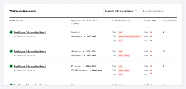
We solved this problem by separating the arrow from the number and showing color based on context. Instead of the upward arrow always being a static green, it will now display as red or green based on context.
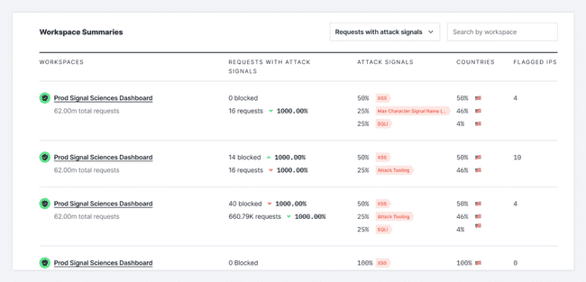
Less is more: condensing color for clarity
We decided our guiding principle with color would be less is more. With many actions on any given page, using color to differentiate every action was creating a lot of noise. To reduce visual clutter and make important information stand out, we decided to consolidate and remove colors.
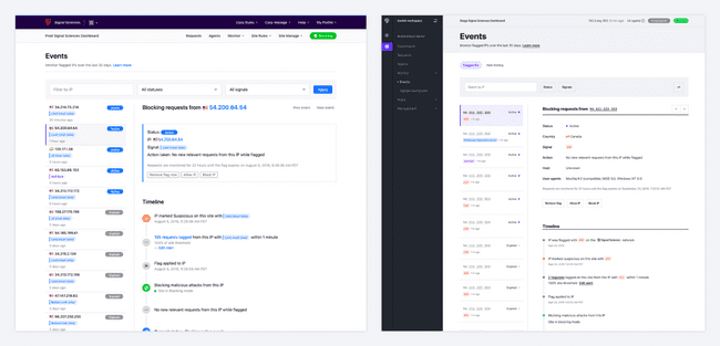
By deemphasizing color we were able to focus the user on what was important on the page. In the example above there was so much blue that the color became meaningless. By reducing the use of blue, we were able to make the story of the event stand out. Now, the timeline is easier to read, the country flags no longer get lost, and it’s easier for users to take in all the important information about an IP without getting distracted by all the other actions they can take.
Making data viz accessible
Data visualization plays an important role in our console because it allows users to see a high-level view of how they’re being attacked. We used a set of colors for each data viz chart, but they weren’t tested for WCAG accessibility and didn’t match the voice and tone of our console.
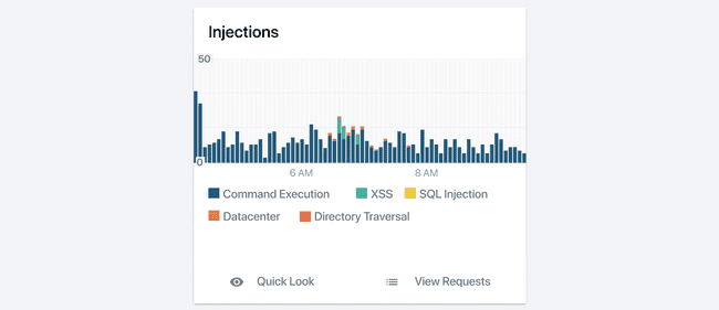
Accessibility matters a lot to us not just because it’s the right thing to do, but also because some enterprises can’t use us if we don’t meet WCAG standards. We wanted to see what our original colors looked like through the eyes of a colorblind person, so we tested them using the Color Blind Figma plugin. This plugin was great because it simulates the six most common types of color blindness—giving us the ability to see what our colors looked like for a wide range of people.
The test revealed that our original data viz colors were difficult to tell apart.
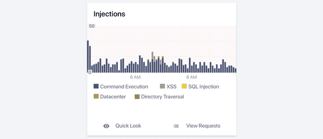
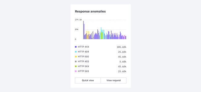
To figure out what our new set of colors would be, we gave ourselves a set of standards to work toward. We wanted these new colors to be vibrant, engaging, and modern, while still being WCAG compliant. We decided to start with our brand color purple and selected complementary colors that had good contrast. We knew contrast was the key to color accessibility because that’s what made each color distinct. But finding this balance meant manually tweaking every single color until our color palette was usable for every colorblind simulation.

Finding the perfect color contrast across every simulation was difficult in practice, so we came up with a strategy to focus higher contrast among the first three colors that users see the most. The last three colors still had contrast, but the contrast wasn’t as strong. This gave us a good balance and prevented us from continuing to tweak colors and never feel satisfied with the results.
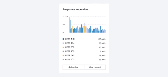
Finding accessible colors was a slow and detailed exercise but we’re happy with our new set of colors and feel like they now speak to the heart of our brand.
The future of color
Refreshing our color design system was laborious, but the results were worth it. We’re now more intentional about how we use color, and by dramatically toning down our usage of color it has greater impact, better legibility, and improved usability. Now each page has a clear opinion about what the most important information for the user is, and we have a system in place to keep color consistent.
